|
|
|
|
|
|
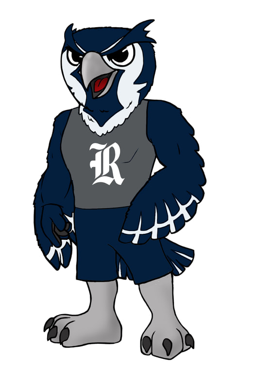
CHALLENGE 1. Strong affinity for the Old English R but a lack of broad recognition. 2. Mixed feelings for the Old English Script with a sense it is disconnected from the direction of Rice Athletics. 3. Fondness towards being an owl and all that it represents but a desire for an owl mark that is dynamic, sharp, aggressive and relevant. 4. Need for marks that are legible, usable, recognizable and consistent. |
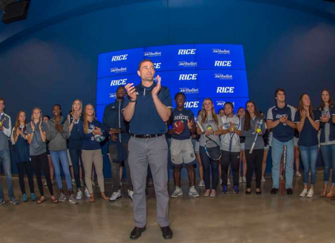
ACTION 1. Researched the history of the Rice University Athletics marks. 2. Conducted over 50 interviews with various constituencies. 3. Sent a survey to over 25,000 people. 4. Based on feedback, worked closely with Designers from Torch Creative and adidas to ensure marks represented an authentic Rice Athletics brand. 5. Frequently met with stakeholders to get their input and buy-in as marks evolved. |
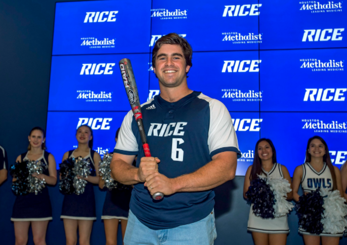
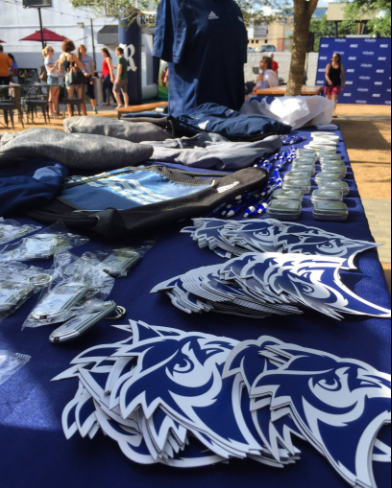
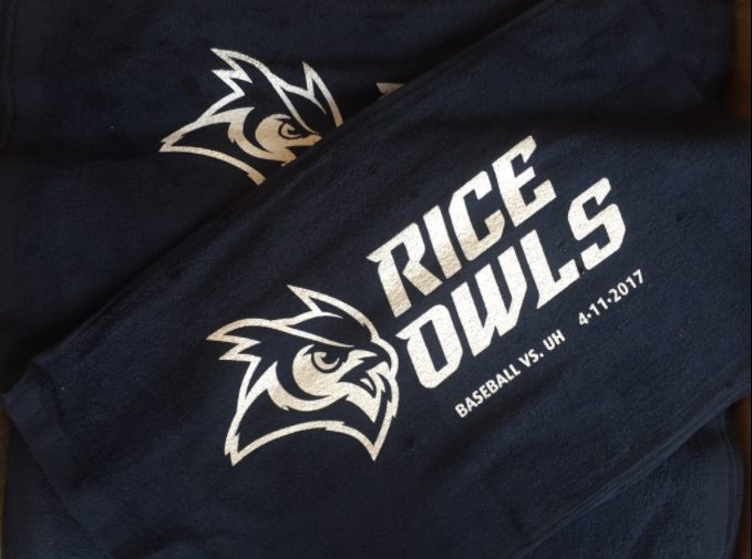
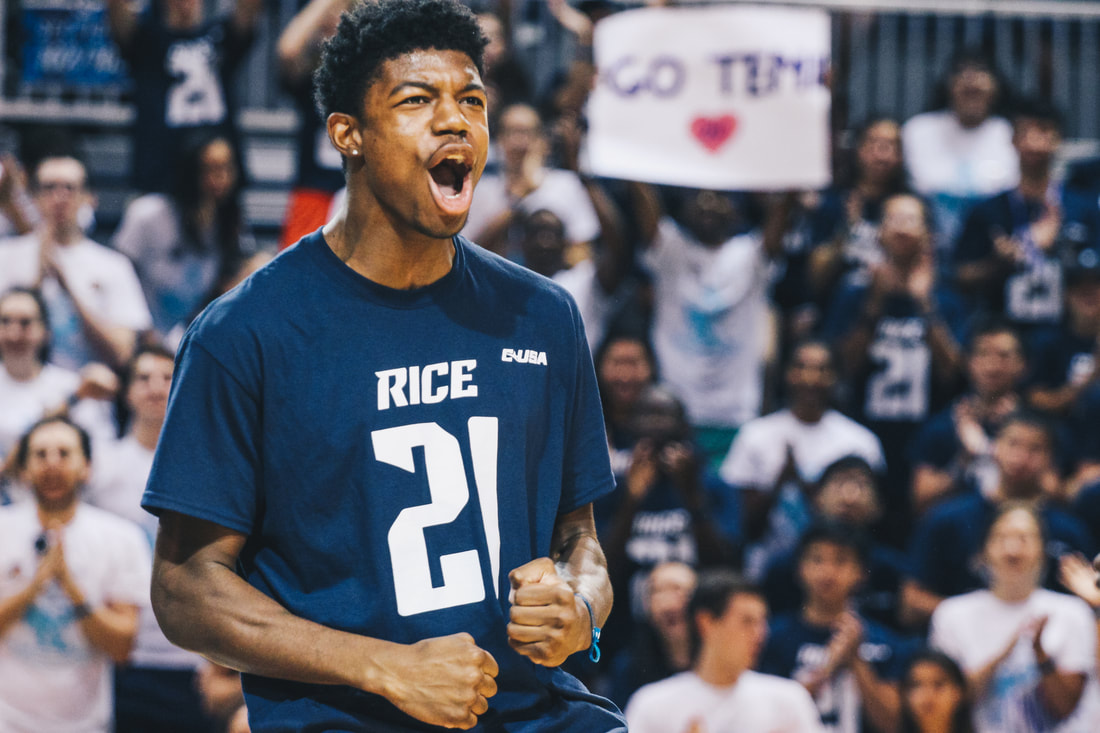
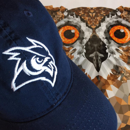
RESULT A refreshed family of design elements centered around our primary mark, the Old English R. 1. Wordmark 2. Owl head 3. Owl body 4. Fonts 5. Numerals |