|
Based on feedback we received during the Research Phase, we worked closely with designers from Torch Creative and adidas to ensure our marks represented an authentic Rice Athletics brand: dynamic, sharp, aggressive and relevant. We also frequently met with our key stakeholders to get their input as the marks evolved. The result of this process is a refreshed family of design elements centered around our primary mark the Old English R, including a refreshed wordmark, owl head, owl body, fonts and a set of numerals. 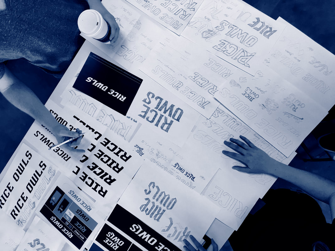 |