 There are three Starbucks at the Shepherd & West Gray intersection (four if you count the one in Kroger just down the block). This fact has irked me ever since I discovered it recently. It initially seems senseless to saturate that corner, but I had to make sense of it.
Starbucks sees an opportunity to feed the market. They call this strategy “Main & Main” where they find a high-traffic locale and open up shops. Each location is slightly different, tailoring the experience to different needs. * Knowing that the majority of coffee sales are generated before noon, each location indirectly works together to reduce bottle necking and allows customers to get their caffeine-fix in a more streamlined way.
Between all the different ways to order, pay, receive and consume coffee, Starbucks does not fear cannibalization, and instead banks on the unplanned, yet convenient, cup to drive overall sales. What it all comes down to is persuading its customers that they have no choice but to grab a coffee. It is right there. No excuses. Whether it is at Location One, Two, Three or Four, through consistent and persistent marketing, Starbucks does not care where -- it focuses on the "stronger together" mentality. That is pretty powerful positioning (literally and figuratively). * Two of these stores are licensed, not franchises. The licensed cafes are incorporated into already existing storefronts via strategic partnerships, with Barnes & Nobles and Kroger. Starbucks licenses the rights to serve its coffee and trains other companies’ employees to sell its products. (Brilliant, right?) The main differences appear to be which gift cards are redeemable and that employees may get called off to work “others duties as assigned.” A Carnegie Mellon professor once said, "Our duty as designers is to rid the world of ugliness." Over a decade later, I still take that responsibility to heart. I interpret "ugliness" as ill-defined purpose, poor function, confusing directions, frustrating experiences.
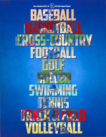
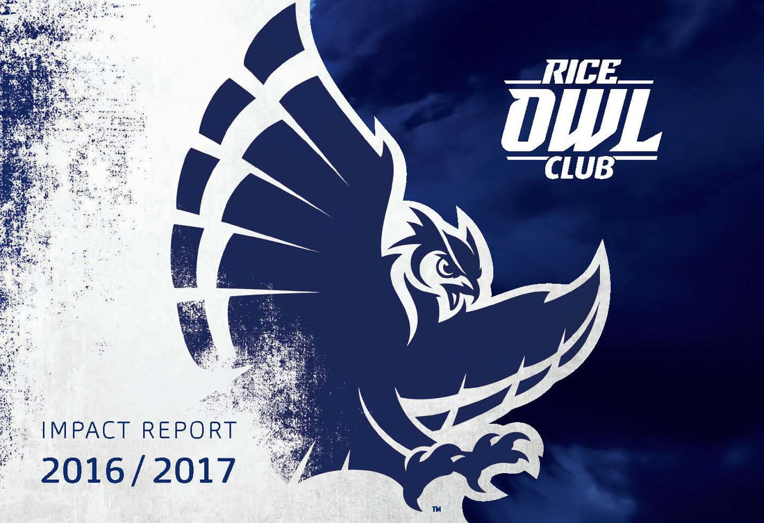
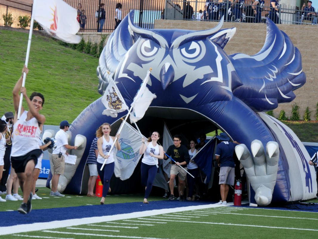
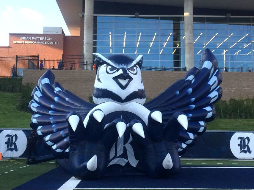
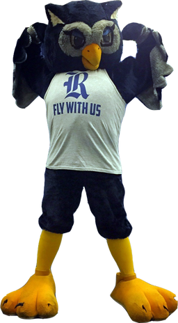
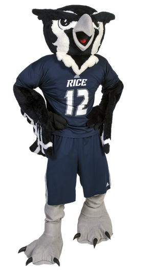
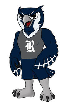
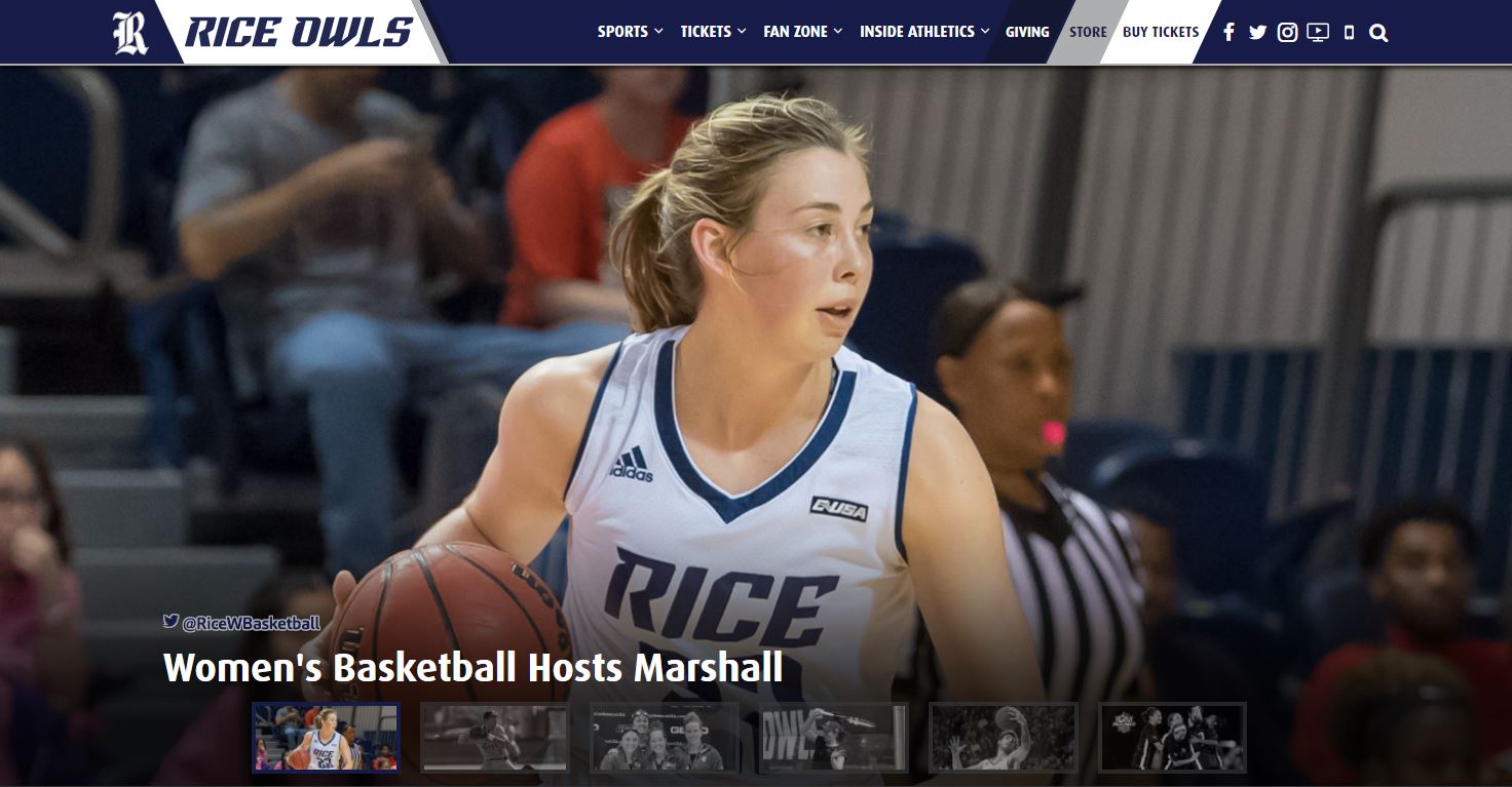
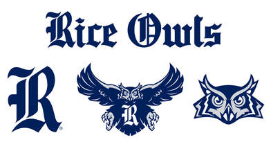
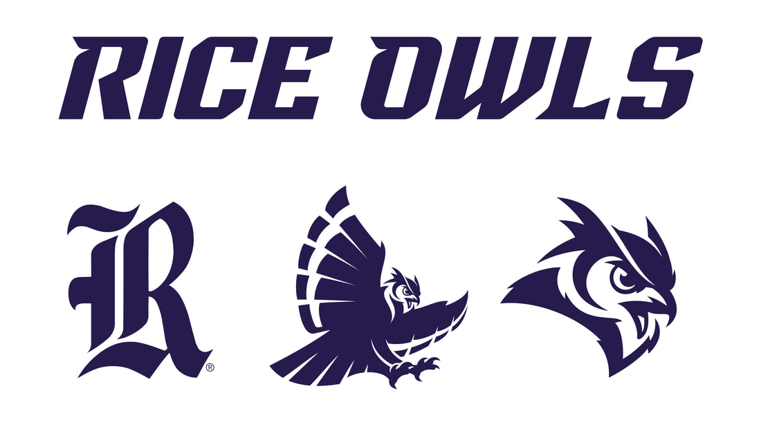
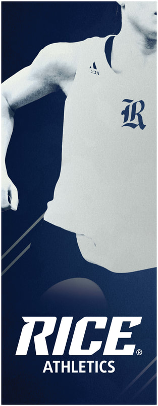
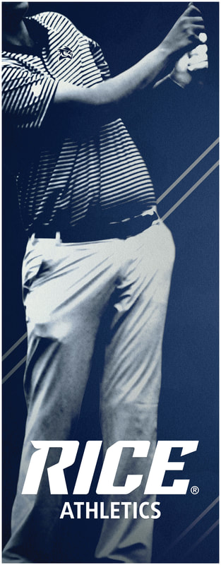
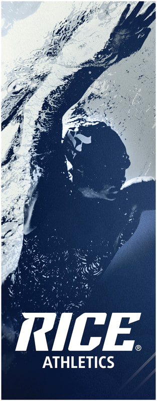
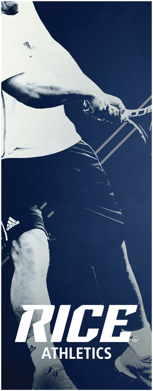
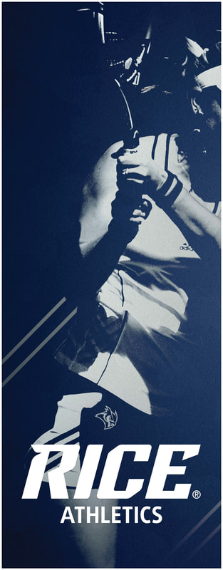
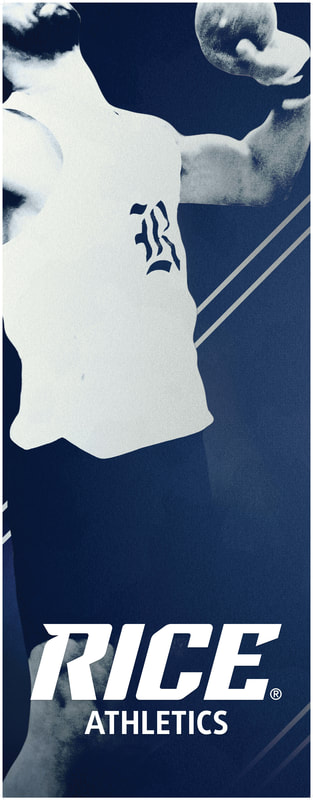
Designers solve problems. They reduce clutter and incorporate more intuitive, aesthetic outcomes to improve human interactions. There is reason, passion and/or cognition; there is strategy, intention and purpose. It is not as much about invention as innovation, to connect the dots and improve upon them. For instance, I walk into a bagel shop or an ice cream parlor and immediately see opportunity — fix the ingress/egress, print the menu board to improve readability, rearrange the layout chairs and tables. It is simple things that would take a literal hole in the wall, patch it and completely transform the space. Everything artificial is designed in some form or fashion. Whether it is a parking lot, presentation deck, coffee pot or cellular phone, everything relies on interactions with the end goal (hopefully) to improve the function, value and appearance based on human-factors. It may seem pompous, or lofty, to think Designers are the world's fixers but they sure do make life more practical, pleasant and beautiful. I recently started watching the TV show Portlandia. Fred Armisen and Carrie Brownstein capture how restaurants attempt to enhance the customer experience by offering high customization but instead unnecessarily complicate it. In this case, there are so many steps that the reason the customer came in the first place (to get a Pastrami sandwich) never actually happens. The navigation, order process, delivery, customer service, signage, all severely impact the dining experience. The restaurant took something easy and made it hard, which becomes even more difficult when you are hungry. It reminds me that efficiency and effectiveness are key components to any experience. This restaurant designer clearly did not take her customer experience into consideration! (I'm fully aware this is satire.) In Rory Sutherland's TED Talk "Life Lessons from an Ad Man," I learned of the Diamond Shreddies case study. Ogilvy & Mather created intangible added value, without changing the product in the slightest. It makes me laugh every time I watch the video. Throwback to last year's unveiling of the Rice Athletics brand refresh. Can't believe it's been a year! Today, Rice Athletics opened its first off-campus retail outlet dedicated to Rice Owls merchandise. For a total of seven points-of-purchase between in-venues, on-campus, online & on-the-go trailers, this location allows us to continue to offer our brand to a wider audience in Rice Village and surrounding areas. Last year's licensing revenue was the highest in school history, with an increase of 17% from the previous year. Since the rebrand, Rice Athletics is on track to increase revenue further for a total of 34% in just two years. 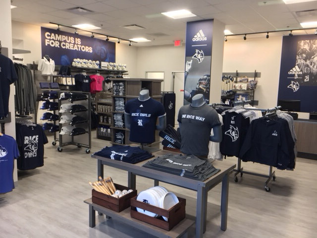 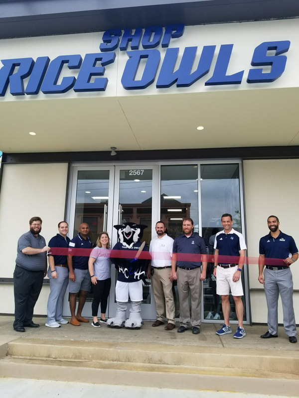 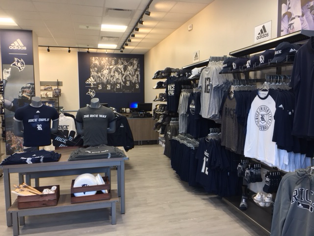 Based on feedback we received during the Research Phase, we worked closely with designers from Torch Creative and adidas to ensure our marks represented an authentic Rice Athletics brand: dynamic, sharp, aggressive and relevant. We also frequently met with our key stakeholders to get their input as the marks evolved. The result of this process is a refreshed family of design elements centered around our primary mark the Old English R, including a refreshed wordmark, owl head, owl body, fonts and a set of numerals. 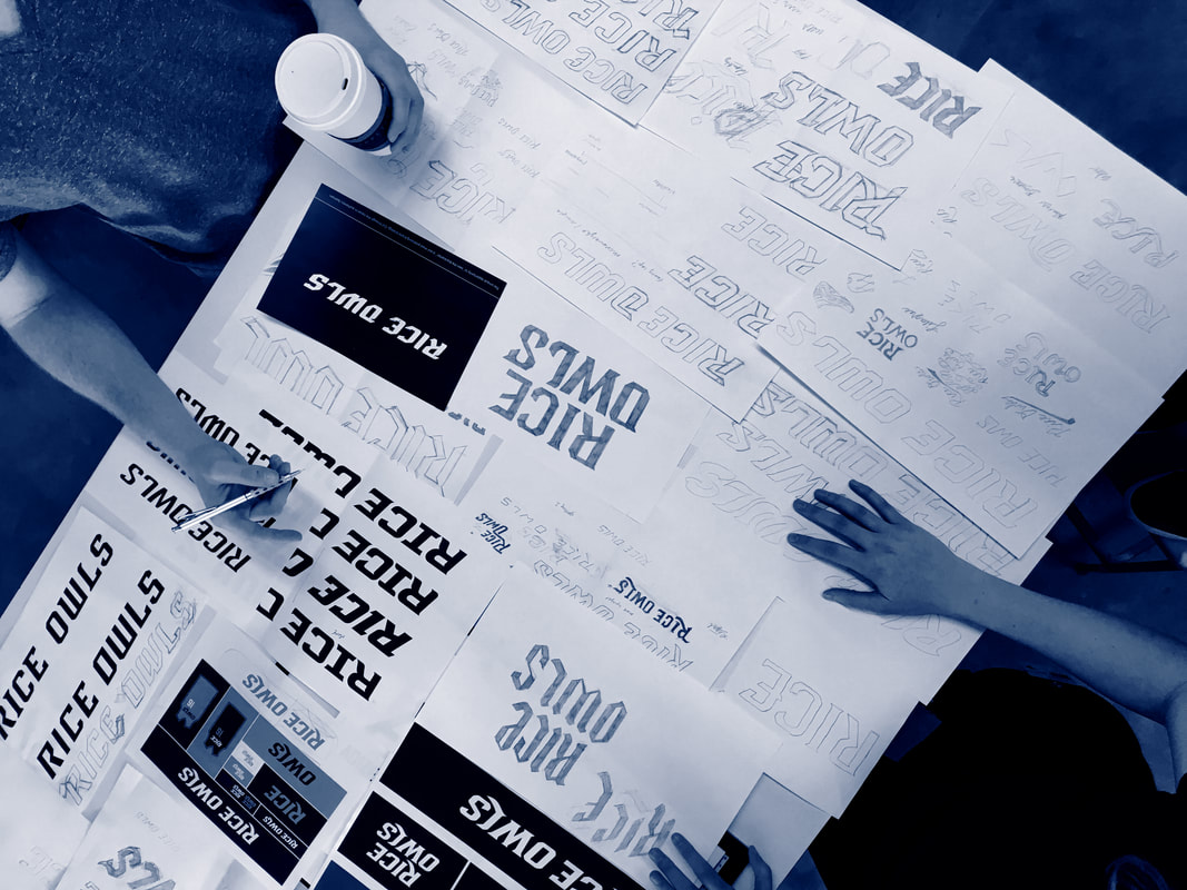 An aspirational and memorable brand is more than a logo, a name, a phrase or an idea. It is an impression, a feeling, an affinity. The Rice Athletics brand is the culmination of everything we stand for - our culture, our interactions, our performance. It is our connection to the community and its connection to us. Our reputation and core values have remained but we saw an opportunity to grow, scale and innovate. We believe the refreshed family of design elements better embodies what our brand represents and will help amplify our brand in the years to come. It unifies, simplifies and pays tribute to the program's vision for and investment in the future. As part of the overarching Rice University brand, the Athletics Department has developed an identity standard to better tell our story across a wide range of applications and media. It promotes the clear and consistent use of these standards to staff, partners and suppliers, thereby reinforcing Rice's identity in an authentic and recognizable manner. The new identity is the road map to create excitement around and develop a strong passion for Rice Athletics, while also engaging new audiences in a distinct and impactful way. The standards extend to the use of official colors, athletics marks, wordmarks, typography, lockups and other matters that affect Rice Athletics' visual identity. "The whole rebranding week was a huge success.
|